Tuesday, April 12, 2011

Plein Air Week 3: Hamilton Avenue

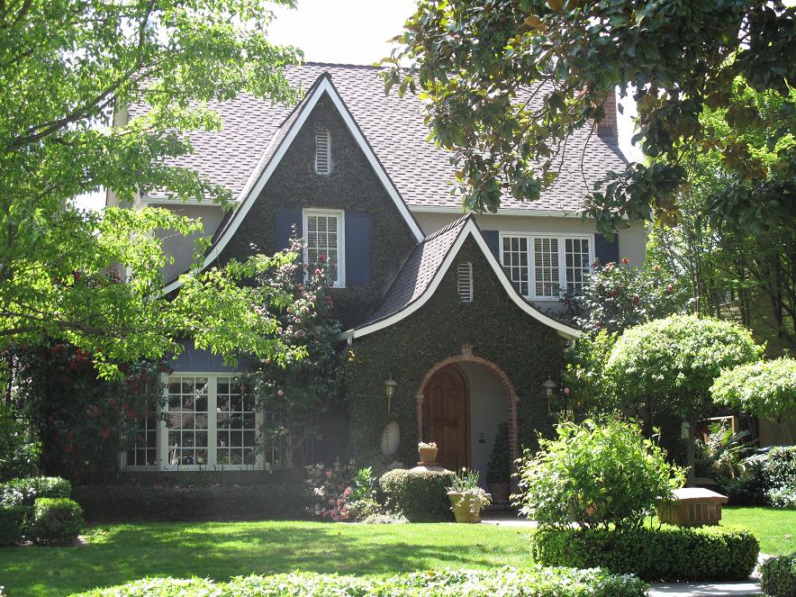
I live near a street with a lot of really quaint old houses with amazing landscaping. 


For my focus next week I'm going to work on painting at least one of the houses from this street.

 I went during lunch today and took some photos of a couple that were especially nice so I can practice at home a few times before doing it "for reals."

I'm a little worried that at some point when I actually set up to paint right on the sidewalk in front of their house things could get a little tense with the people that live there.  I'm not sure what the etiquette is, like whether I should knock on their door and ask, or just go for it.  Hopefully if they're even home they'll feel flattered.

Maybe if any of my preliminary sketches go well I'll bring them along and give them one as a peace offering.  :)


I'm still working on cumulus clouds.  So far no luck!  Which means I'm botching most of my skies lately unless I leave them very plain.  The vegetation here is also overworked.  I think I put in the darks too densely, too near the top of the plant.  The green mini hedge gave me some trouble - I think if I took it more slowly I'd have better luck.  I like that I was able to keep the brightness of the side of the house.


I painted this doorway in less than an hour during a lunch break and I think the doorway itself turned out pretty well.  I think it has depth, and I like the white reflections on the door.  If I add a shadow to the wheelbarrow I think it'll help it, and if I faded out the path sooner, or did dark grass and a light path that would probably have been a better choice.  My white shutters in both paintings haven't looking very convincing.  For one thing, instead of the dark outlines I will try a pale gray next time for texture and indicate the shadows and edges with a darker shade of the house color.  

The big problem is really the plants.  I'd blame the trouble on lack of time, but my plants always come out kind of like this.

I'll probably just do one more painting of this house, I need to do the on-site version, and then I'm going to spend the rest of this week practicing shrubbery, trees and skies.

This is still a work in progress, I like the sky though.  Really, really pale colors are what worked, I started with a pale blue on the left and then added a little yellow as I went right.  Lucky I didn't turn everything green!  I still have more to do on it, but I couldn't stay at the site any longer (rain!) so I'll have to finish it up at home.

Oh, funny story - a bird pooped on it and on my hand!  Guess we know what the bird thought of my work.  :)

Monday, April 4, 2011

Plein Air Week 2: Rengstorff House


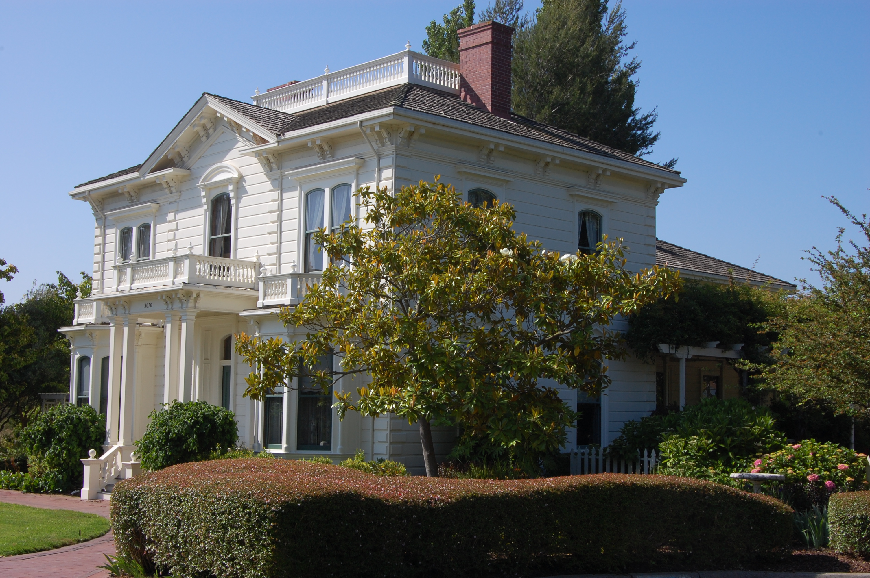
 This week I'm going to be painting Rengstorff House, which is the oldest historic house in the town where I work.  Tonight I did a small (7x9ish) from this photo:  Rengstorff House


I did a trace of the photo onto the paper so I didn't have to worry about the drawing skills (or lack thereof).  I wanted to focus on composition and value for this first pass at home.


There are lots of things I'd do differently, but I'm pretty proud of this effort.  It is the first building I've done that looked halfway decent.

Lessons learned:
  • I meant to have the three main visual elements be the chimney, the rosebush on the lower right, and the upstairs windows, in a kind of triangle.  I think I could tie them together better using a common color, which shouldn't be hard... I'll just use that chimney red in all three.
  • I need to figure out that tree in the center - it has taken over the whole thing!  And it's not very appealing for the main element to be right in the middle of the picture.
  • I also need to figure out the hedge in the front and the big shady area on the side.
  • The trees behind and on the left side should be a few values darker, and I'll probably eliminate the tree on the far right completely and make up a rose-garden there.
  • A more vivid blue sky behind the house would probably frame it really nice too, and then I could do the very top balcony part in all white with some dark blue for the railings... it'd probably make a great contrast.
I'm hoping to do a quick lunch time visit over there in the next couple of days and take some photos and find an angle I really like, then do at least one more practice sketch at home before I get out the new big paper.  I splurged and bought a big block.  And honestly, with paper that big I'm really going to need a bigger brush!

The next night I did another painting of the same scene but on bigger paper (not the big paper, just 9x12):


At first I didn't like it as much as the first - The tree in particular is not as good, but some of the shadows are nice, and there are less muddy problem areas.  I think with more contrast it could have been better than the first.

I took a trip to Rengstorff House today to check things out.  It was such a beautiful day!  After taking some photos I couldn't resist doing a quick sketch of a little garden shed on the grounds.

I ended up doing this painting with my little paints kit and waterbrush.  As usual, it doesn't have enough contrast, and I would have loved to have more time on it, but I really loved painting the flowers on the tree.


I went with a small group of people and did another painting of Rengstorff House.  I took some liberties with the landscaping, and my final result kind of defies the laws of nature, so try to ignore the pond on the hill.  :)  Another valuable thing I realized with this painting was that I need to use different colors, especially my greens, to indicate Spring.  Last, I regret using the brown tones for the house and not saving enough white.


I am going back to Rengstorff House again during lunch this week for another try and I'll post my progress here.  It is such a beautiful, peaceful location that it's a pleasure to spend time there.  I'm also going to start a new thread for another location I'm going to start this weekend.

Here's another attempt from the same angle as last time:

Thursday, March 31, 2011

Plein Air - Week 1

I'm going to spend the next few weeks focusing on loosening up my style, and painting outdoors. This will really force me to work on some of the things that I'm not good at, particularly perspective, composition, sketching, painting plants and buildings... pretty much everything!

Recently I've been using a lot of paintings or photos as my source, and it will be good for me to simplify real scenes.

This first warm-up I did at home, and I was just trying to paint loose and relaxed. I'm including it here because I think it may be the best sky I've ever done. I wish I could remember my trick! The rock and the figure are hideous, but you get to see them because I like the sky so much. :)


And here are a couple of things I did on lunch-breaks. The first one is at a park really close to work and I will probably continue to paint scenes from there quite a bit because it's quiet and quick to get to. This house is supposed to be a cube, with the front corner right in the center of the picture. It just looks flat though. The only thing I kind of like about this one is the lower left corner, which was just a fluke because there's no pond here in real life.


I don't think I'm going to ever finish the second.  I spent quite a while on it and it has a couple of nice things and some unfortunate things as well, but when you don't finish your outdoor painting and didn't bring a camera it's definitely challenging to try to recreate it from memory.

Week 8 - Lace and Cloth Draping

I wasn't too excited about the topic for the last class and having tried painting lace curtains I don't think I'll be adding them to my regular subject matter!  I think this came out all right, but I think it's a subject that is difficult to rush.


I did like the teacher though, and maybe next fall I'll sign up for her class again.

Monday, March 14, 2011

Week 7 - Fish

Usually I try to practice the class subject at least once before I have to do it in class. I think it helps me get more out of the class time. This week though, I just couldn't get excited about practicing fish paintings so my only fish are these that I did in class tonight:

And to tell the truth, I actually really enjoyed painting these guys and might try a few more.

The teacher gave us a specific technique for painting like this. First, wet the paper with clear water where you want the spots. Then add an opaque yellow to the water, followed by a wet overlay of opaque red. Next use ultramarine to add some shadow to the sides, letting it run into the other colors. Thin with water and bring to the face of the fish. Bring some more colors to the fins and add a light lavender. Make sure to leave lots of white paper in the fish. Once the face is dry add the eyes.

The water was interesting. It's the first time that I mixed up some puddles of color in dishes, got the paper wet, and the poured the paint on. It was interesting to see what happened, but trying to get the water to move nicely between the fish was impossible and I ended up glazing blue over the whole thing to try to hide the mess, and then dark-lining the fish to give them more depth.

The other thing I did this week was just a quick sketch of my church on the rainy day. I clearly overworked it in almost the whole thing, but I kind of liked the sidewalk. Plus I think I could do the steeple right now that I've tried it once. I wish I'd saved more whites!

My current class only has one more week, and now that the weather is getting really nice I think I might try to start doing some on-site painting. I'd really like to get better at painting from life.

Thursday, March 10, 2011

Week 6 - Flowers Close-Up

Another week of flowers. I wanted to find something a little looser than trying to paint true to life flowers and ended up doing a step-by-step that I found in a book by Charles Reid. I probably like this one better than the one I did in class.

The class one is having some composition problems which I won't list. I kind of like the rose on the table blending in to the vase. I did that on purpose and it's almost what I was going for, but the flower part needed less brushstrokes, and better shape. The droopy pink flower is my favorite.

Tuesday, March 1, 2011

Week 5 - Flowers in a Field

Here are my little practice paintings of flowers. I wasn't really looking forward to this subject, foliage is still very challenging for me, but I ended up having a good time with it.


Here's the one I did during class. I love the mountains and the bright colors. This might be the most colorful painting I've ever done, and there's definitely a range of light and dark.


I like it, but I also really overworked it in a lot of places.

Cropping for the win! :)